Creating product visuals for ecommerce rarely fails because you have no ideas.
It usually slows down for smaller, messier reasons: the background is not clean enough, the product looks slightly different from shot to shot, the first screen needs a stronger visual hook, and the detail page still needs benefit blocks, lifestyle scenes, carousel images, and maybe a simple logo direction.
What looks like "just list one product" can quickly become a full visual production job.
This walkthrough uses a tumbler cup as the example. The same workflow also works well for small appliances, skincare, fragrance, pet products, accessories, stationery, and any physical item with a clear shape. The goal is simple: start with one usable product photo, then use DreamWith and Nano Banana 2 to turn it into a practical set of ecommerce assets.
Why One Product Photo Can Be Enough
For ecommerce image generation, the best starting point is not a blank prompt. It is a real product image.
When the model can see the shape, color, material, handle, lid, straw, and proportions of the item, it has something concrete to preserve. That makes the whole workflow more stable. You are not asking AI to invent a product. You are asking it to extend the product into different commercial contexts.
That matters for two reasons:
- The product is less likely to drift into a different item.
- The final page feels more consistent because every image shares the same visual source.
Here is the starting point for this example: a clean ecommerce product retouch of a tumbler.
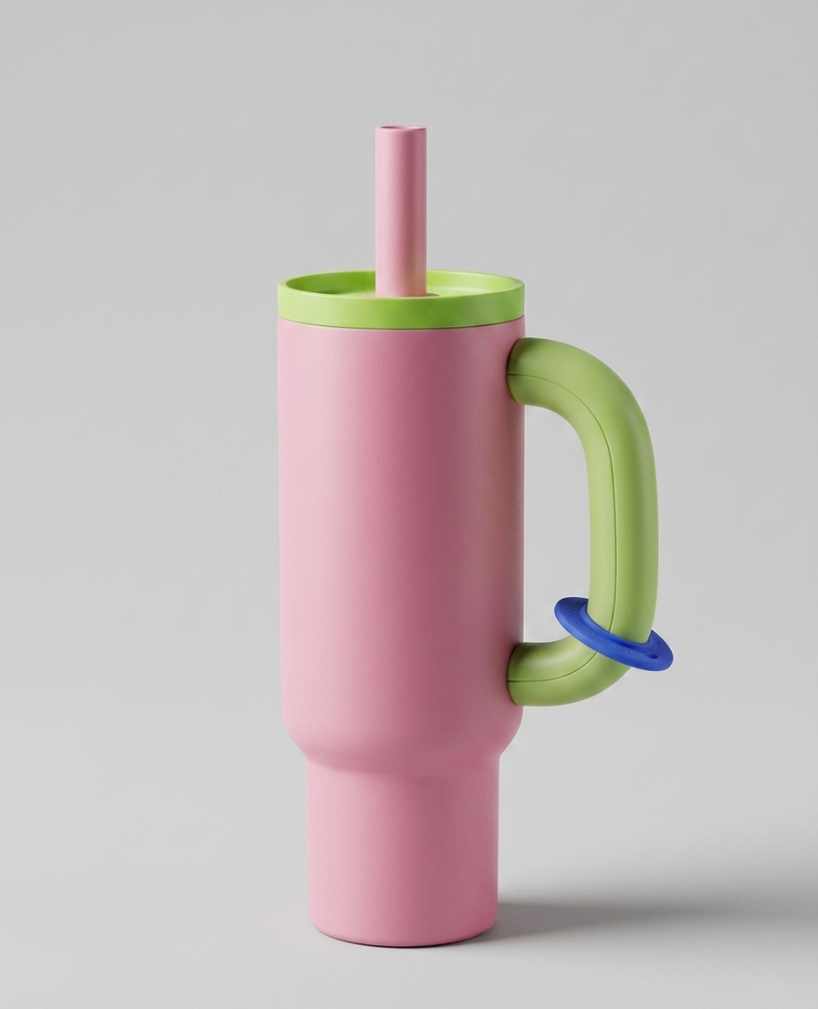
It is not a complicated image, and that is exactly why it works. The product is easy to read, the background stays quiet, the matte surface has texture, and the color palette is clear enough for the model to reuse.
Step 1: Retouch the Product Before Designing the Page
A common mistake is to jump straight into "make a premium ecommerce poster."
That can work, but it also invites trouble. The cup may change shape. The handle may become strange. The lid, straw, or color may drift. Sometimes the model simply decides to improve the product into something you never sold.
A steadier approach is to create a clean product reference first. Think of this as your reusable base image. You can use it for detail pages, hero images, lifestyle scenes, ads, and product comparison blocks.
Try a prompt like this:
Retouch this tumbler product photo for ecommerce use. Keep the cup's proportions, colors, handle, lid, straw, and overall structure unchanged. Replace the background with a clean light gray tabletop studio background. Make the edges sharper, the matte texture more visible, and the reflection natural and clean. Do not change product details. Do not add extra decorative objects.This step does not need to be dramatic. In ecommerce, accuracy is part of polish. Once the product looks stable and clean, the rest of the page becomes much easier to build.
Step 2: Generate the First-Screen Hero Visual
The first screen of a product page has one job: help the shopper understand what the product is and why it feels desirable.
For this tumbler, we use a bright macaron color direction, a clean summer tabletop scene, and clear space for headline and selling points. The result can work as the top section of a product detail page, a campaign landing page, or a social ad creative.
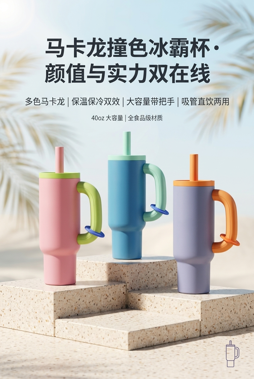
A prompt for a similar result:
Based on the reference tumbler, create a 2:3 vertical ecommerce product page hero image. The style should be bright, clean, refreshing, and minimal. Highlight three macaron-colored tumbler cups. Place the cups on a terrazzo-style tabletop, with a soft blue sky and blurred palm leaves in the background for a summer lifestyle feeling.

Top headline: Macaron Color Tumbler, Built for Looks and Daily Use
Subtitle selling points: Multiple soft colors | Keeps drinks hot or cold | Large capacity with handle | Straw and direct-drink lid
Supporting copy: 40oz large capacity | Food-grade materials

Keep the product proportions realistic. Make the text clear and avoid covering the product.
The important details are not the adjectives. They are the constraints: aspect ratio, page role, product consistency, scene style, headline, benefit copy, and layout requirements. A prompt like "make a high-end detail page" is usually too vague. The model will fill the gaps on its own, and those guesses may not match your product.
Step 3: Turn Benefits Into Real-Life Scenes
A detail page should not read like a spec sheet from top to bottom. Shoppers want to picture the product in their own day.
For a tumbler, the natural use cases are obvious: commuting, workouts, office desks, home breaks, road trips, beach days, and weekend walks. Turning those moments into page modules makes the benefits easier to understand than simply writing "keeps cold for 24 hours."
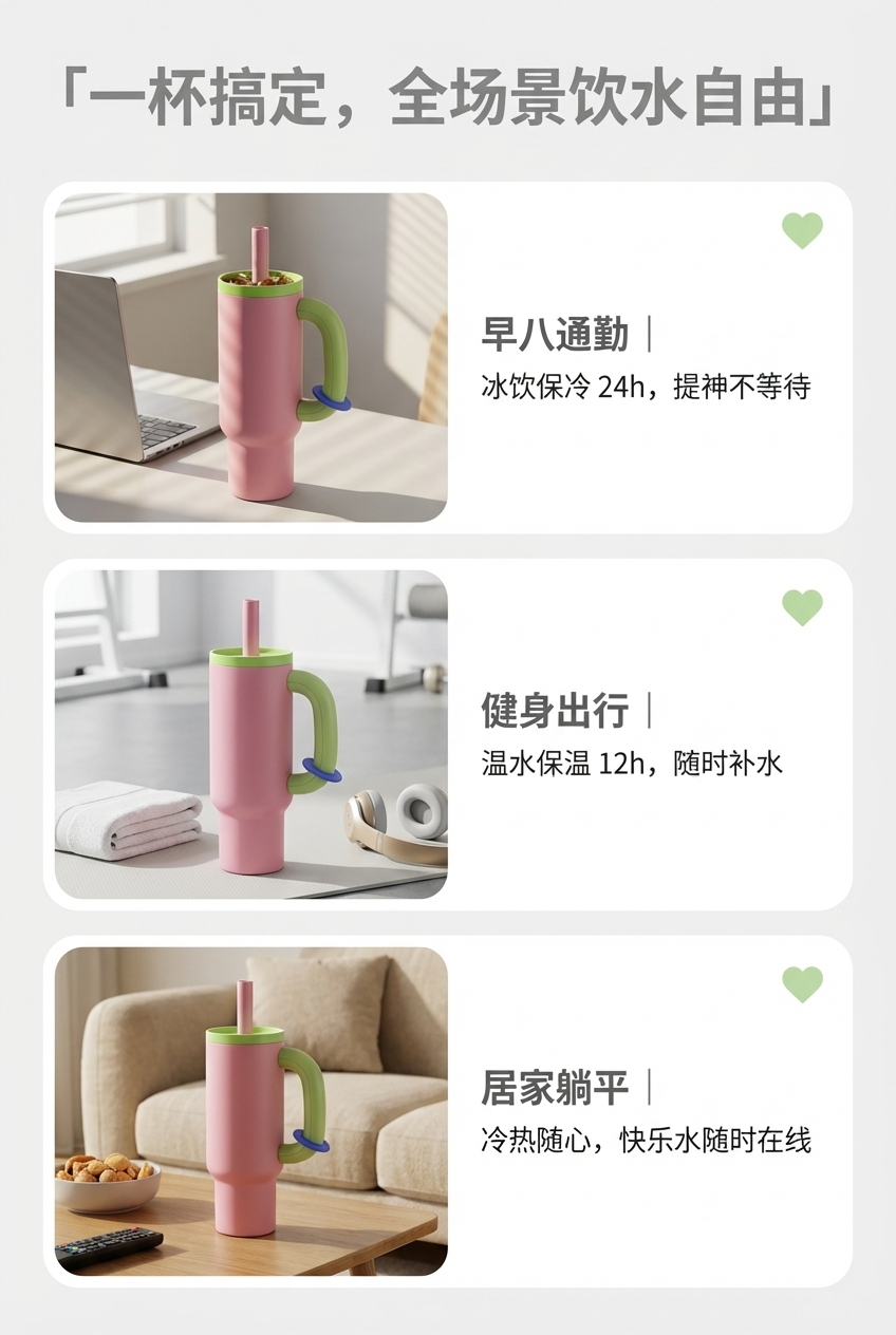
Reusable prompt:
Create a 2:3 vertical ecommerce product page lifestyle scene image for this tumbler. Use a light gray background. Divide the page into three rounded modules stacked vertically. In each module, place a lifestyle scene on the left and short benefit text on the right.

Module 1: Office commute. Put the tumbler beside a laptop with morning sunlight coming through a window. Text: Morning Commute | Keeps drinks cold for 24h, refreshment ready anytime.
Module 2: Workout and travel. Place the tumbler near a yoga mat, sports towel, and headphones. Text: Workout Ready | Keeps drinks warm for 12h, hydration on the move.
Module 3: Home break. Place the tumbler near a coffee table with snacks and iced milk tea. Text: Home Reset | Hot or cold, your daily drink stays close.

Use generous spacing, readable typography, and consistent product appearance.
This kind of image is strongest in the middle of a product page. It does not need to grab attention like the hero. It needs to make the shopper think, "Yes, I would actually use it that way."
Step 4: Build Clear Benefit Blocks
After the lifestyle section, shoppers still need concrete buying reasons. How large is it? What is it made from? How long does it keep drinks cold or warm? Is it easy to carry?
The image below breaks the information into three visual blocks: color, capacity, and temperature retention. This structure works for Shopify product pages, Amazon-style detail sections, marketplace listings, TikTok Shop, and independent brand sites.
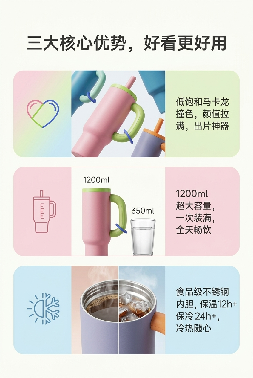
Prompt example:
Create a 2:3 vertical ecommerce benefit image for this tumbler. Headline: Three Everyday Advantages, Better Looking and Easier to Use.

Divide the page into three horizontal sections:
1. Soft macaron colors, highlighting the product's photogenic color palette.
2. 1200ml large capacity, with a simple visual comparison against a regular water cup.
3. Food-grade stainless steel liner, keeps warm for 12h+ and cold for 24h+.

Use a soft macaron color system, clean modules, readable text, and realistic product proportions.
One practical note: do not let AI invent product specs. Capacity, material, insulation time, safety certifications, and warranty terms should come from your real product data. Let the model handle the visual expression. You handle the truth.
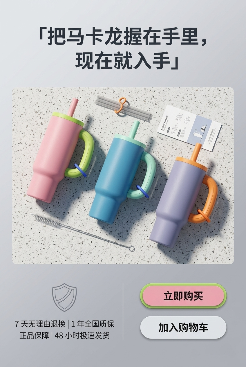
Step 5: Add a Closing Conversion Image
The last screen of a product page should do more than say "thanks for reading."
It is a good place to bring the product back into focus, add service promises, and give shoppers a final reason to act. You can use this section for return policies, warranty notes, shipping promises, bundles, or a simple add-to-cart push.
Prompt example:
Create a closing conversion image for an ecommerce product detail page for this tumbler. Use a top-down composition. Place three color variants of the tumbler on a terrazzo table, with a straw brush, instruction card, and small accessories nearby.

Top headline: Hold a Little Macaron Color in Your Day
Bottom service points: 7-day returns | 1-year warranty | Ships within 48 hours
Buttons: Buy Now, Add to Cart

Make the overall style clean and trustworthy. The buttons should be visible but not exaggerated.
This image can also become the final section of a landing page or the closing frame of a short social ad.
Step 6: Extend Into Horizontal Carousel and Ad Assets
Most ecommerce teams do not only need vertical detail page images. Product carousels, ad creatives, marketplace banners, email headers, and social covers often need square or horizontal versions.
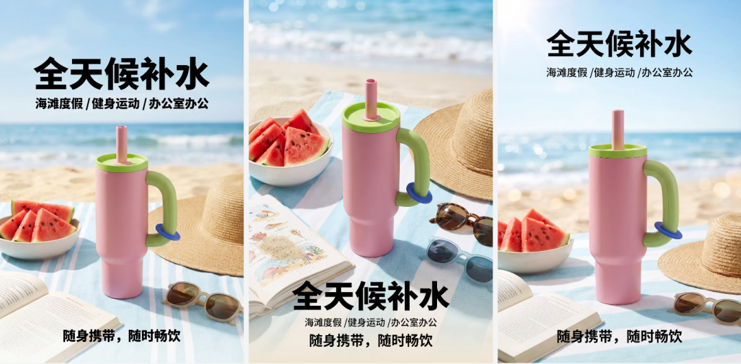
In this example, the tumbler is placed into a beach picnic scene, with three related compositions in one horizontal layout. It is useful for product carousel testing or quick ad variations.
Prompt example:
Based on this tumbler, create a three-panel horizontal ecommerce display image. Keep the same cup shape, color palette, and product structure across all three panels. Use a beach picnic tabletop scene with watermelon, a straw hat, a book, and sunglasses.

Main headline: Hydration All Day
Subtitle: Beach trips | Workouts | Office days

Make the image bright, refreshing, and suitable for ecommerce carousel images and ad creatives.
If product consistency matters more than style exploration, add one more line:
Do not change the cup handle, straw, lid, cup body shape, or product proportions.It sounds plain, but plain constraints often save a lot of rework.
Step 7: Explore a Simple Brand Logo Direction
If you are building your own brand, the same workflow can continue into logo direction and brand applications.
In this sample, the brand name is Warmmark. The concept uses sunrise, wave lines, steam, and warm colors to suggest daily hydration and a friendly lifestyle mood. The image also shows how the logo might look on a cup, business card, and tote bag.

Prompt example:
Design a logo for a tumbler brand. Brand name: Warmmark. Tagline: A Fresh Warmth in Every Sip.

Include visual elements inspired by sunrise, soft waves, and steam rising from a cup. The overall feeling should be warm, simple, modern, and suitable for printing on a tumbler, packaging card, and canvas tote bag. Show the main logo, cup application, business card application, and tote bag application in one clean presentation.
A generated logo is rarely the final brand identity. But it is a fast way to explore direction before hiring a designer or committing to a full visual system.
Who This Workflow Is Best For
This AI ecommerce workflow is useful when you are:
- Listing products on Shopify, Amazon, Etsy, TikTok Shop, or a local marketplace.
- Testing new product visuals before a full photoshoot.
- Running a small team without a dedicated designer.
- Creating product posters, detail page sections, lifestyle scenes, and ad images.
- Using Nano Banana 2 for product image editing and ecommerce visual expansion.
It is not a full replacement for professional photography, industrial design, or brand strategy. But it is extremely useful when you need to move fast and turn limited product material into a complete visual draft.
In many cases, that is enough to get the first 70 percent of the page built: clean up the product, explain the selling points, show the product in context, and give the page a coherent visual rhythm.
A Practical Starting Order in DreamWith
If you want to try this with your own product, follow this order:
- Upload the product photo and create a clean retouched product reference.
- Use that reference to generate the first-screen hero image.
- Create three to five lifestyle scene images based on real use cases.
- Turn capacity, material, and feature claims into benefit blocks.
- Generate a closing conversion image for the bottom of the product page.
- Extend the same product into horizontal carousel images and ad creatives.
- If it is your own brand, explore logo and packaging application concepts.
DreamWith is useful here because the whole process can stay in one place: text-to-image, image-to-image, product image expansion, style references, and work management.
For ecommerce sellers, independent brand operators, and content teams, this is not just a visual trick. It is a practical production workflow: make the product clean, make the benefits clear, then make the page feel complete.
Open DreamWith and start generating ecommerce product images